“The retention ladder module forced us to delete three charts that looked impressive and explained nothing. Our PM reviews are twenty minutes shorter now.”
Aisha R., product analytics lead · Kuala Lumpur
DevRoute Center
Usage charts that guide the next release, not decorate the slide deck.
A learning studio in Petaling Jaya for teams building product usage intelligence into everyday decisions.
Flagship path
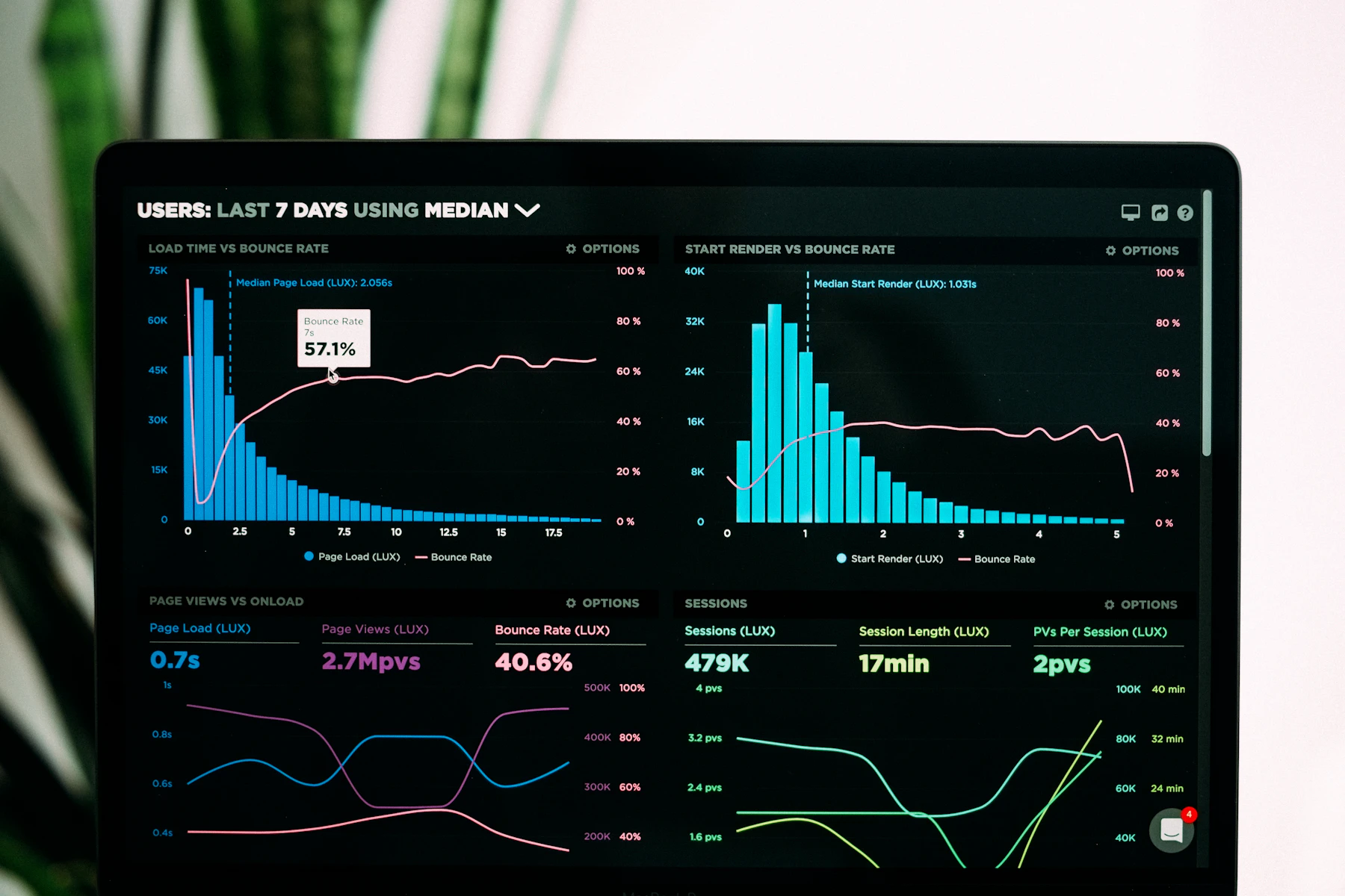
Six modules that move from raw event tables to executive-ready views inside a Data Visualization and Analytics Platform for Product Usage Intelligence.
You leave with a critique rubric, a metric dictionary, and a dashboard skeleton your engineering partners can implement without rewriting the story twice.
View modules and outcomes
Why teams enroll
We teach visual grammar for product data so stakeholders stop asking “so what?” after every review.
From the floor
“The retention ladder module forced us to delete three charts that looked impressive and explained nothing. Our PM reviews are twenty minutes shorter now.”
Aisha R., product analytics lead · Kuala Lumpur
“I liked the metric dictionary exercise, though the homework load in week three was heavier than the syllabus suggested. Still the clearest framing of usage intelligence I’ve seen.”
Client in fintech onboarding · enrolled in Usage Signal Studio
Tell us what your team is measuring and we will recommend a course path or a private clinic.
Talk with DevRoute Center